Contents
Know How to Draw Semi Realistic Portraits
Semi-realism is an art form that attempts to combine realistic and stylized depictions of creatures or scenes. In this article, you’ll learn how to draw a semi-realistic portrait using a computer program. The examples in this tutorial use Photoshop CS5, but you will most likely apply the same principles to a similar program.
Method one
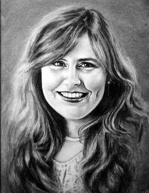
Semi-realistic lady
-
Draw a circle for the head
- Draw the rough outline of the face. Draw 3 horizontal lines: one at the top of the head, another at the lower 1/5 of the circle, and the last at the jawline. The spacing between the first and second row should be equal to the spacing between the second and last row.
- Draw the jaw line and ears according to the sketch line. The ear should be placed just touching the second line. The chin should not extend beyond the last line.
- Draw 2 slightly curved lines (curved outwards but only slightly) to draw the neck.
- Draw the basic outline of the eyes.
- Draw two more guide lines for the nose and mouth.
- Draw the basic features of the face such as nose, eyes and mouth.
- Add the hair. You can experiment with it all you want. Remember that the hair should be drawn outside the circle so it doesn’t look weird.
- Erase the draft line.
- Add more details, especially the hair.
Method Two
Semi-realistic in Photoshop
- Open a new document in Photoshop CS5. Choose Presets > International Papers > A4. Set the resolution to 300 pixels per inch. Next, open the reference photo in another window.
- Create a new layer called “Sketch Lines”. Using the Brush Tool (B) with a suggested size of 10 px, change the color from black to bright . The reason for this is that you want to be able to distinguish line art from sketch lines. Outline the shape of the character, ignore the details such as the face and patterns, and only draw the basic outline of the clothes.
- Draw details such as the face , including the smile line and the edge of the nose. Draw details such as the buttons of the clothes and the creases of the fabric.
- Create a new layer called “Line art”. Change the layer color to red so that you can quickly find the layer in the future. Adjust the brush size to 15px and change the color to black – the shortcut is (D). If using a tablet, click Window > Brushes > Shape Dynamics > Controls and choose Pen Pressure. Draw more defined lines on top while your sketch lines are visible below. Sketch lines will be rough, line art will need stronger lines, so be confident.
- Add skin tone. Create a new layer called “Skin” and drag it below the “Line Art” layer. This way the line art is on top of your skin tone. Make the brush bigger, recommend 140px-370px, and choose a suitable skin color. This can be done by clicking the color picker at the bottom of the left toolbar or by clicking Windows > Swatches . Then color any exposed skin; it doesn’t matter if the color goes beyond the lines. Zoom in close, then use the Eraser (E ) 35px to clean up any lines.
- Color the clothes. The easiest way to add color to an outfit is to think about the order in which it will be worn on your body. For example, a shoe goes on top of a sock, so the shoe layer goes on top of the sock layer. Create a new layer for each piece of clothing and repeat the process for the skin.
Adds color to the face . Adding color to the face is easy. Divide the face into layers. For example, lips, teeth, eyes, eye color and makeup.
- Colorful metal or shiny items. In the example there is a shiny belt buckle. To color shiny items , there are several possible ways. One is to create a new layer and color the project gray or yellow and shades like you did for the rest of the composition. Or, if you’re using Photoshop, create a new layer, set the item color to gray or yellow, then choose Windows > Styles and choose a metallic style; the style will only affect what is drawn on the layer.
- Make the pattern. The top in the example shown here is striped. The easiest and most time-efficient way to draw something like stripes is to lock the layer. At the top of the layer box, you’ll see the word “Locked:” and a checkbox next to it. By clicking this box, it locks the layer, meaning nothing on that layer can be destroyed but can still be drawn on. Use “undo” ctrl+z to carefully draw the stripes over the top to reverse the mistakes, as the eraser won’t work . Another way is to create a new layer called “Stripes” and Ctrl-click the layer icon for “Top”—a dotted line appears to indicate that the layer is selected. By clicking back to the “Stripes” layer, this means the selection is on the “Stripes” layer, but still in the shape of the “Top” layer. You can draw stripes on the skirt and still use the eraser.
- Add shadows. Correctly coloring a piece is very important to ensure the result looks semi-real. For each layer you make (except line art and sketch lines), make a new layer above it called “layer name shadow”. Taking the “Skin” layer as an example, using the eyedropper tool ( I or B+alt ), select the color of the skin (it should be in the color picker), and choose a color that is a bit darker than the original color. Set the brush to 0% Hardness and 40% Opacity.
Using the technique mentioned earlier in the “Pattern” step, select the “Skin Layer” and paint onto the “Skin Shadow” layer. Try not to take the brush off the page as it will create a double opacity the next time the brush touches the page.
When painting the shadows, keep changing the color slightly, darkening each layer to add shadows.
When painting highlights, such as the nose or the ends of the cheeks, select the Base Color and change it to a slightly lighter color , then repeat the process you used when painting. Remember that unless one is in bright light or in a wet/shiny environment, highlights will always have fewer shadows than shadows.
Repeat this process for each layer.
- Make the background. A background isn’t always necessary, sometimes a subtle gradient effect is best. Double click on the background layer and it should unlock, double click again on Layer Options > Gradient Effect.
- Done.